Sometimes, brands can often communicate sustainable products with designs that get straight to the point. However, as sustainable packaging has become more popular over the last few years, we’ve noticed a few big brands going for designs that are obvious by using sustainable design guidelines that are perhaps a little outdated.
It seems crystal clear to go for browns and greens – the natural look – when designing. This works in some context, but at Law Print, we think brands should be enticing users to use their sustainable packaging with eye-catching colours, thus creating on-shelf designs that wow. The many brands under our belt that have chosen Ready2Recycle packaging have strayed away from making these design mistakes. They have instead gone with bright colours, such as bright yellows, oranges, blues, purples, and reds.
It seems that brands face a choice: create a look that is sustainability-centric or throw caution to the wind and design something they really want.
In reality, the browns and greens are more of a considered design choice. This is because they have become synonymous with sustainability, which means the design is doing its primary job: communicating those eco-friendly benefits to the consumer. But what if you could communicate the sustainability of your product without creating these design faux pas?
Could you keep it simple?
By choosing a specific colour as a base for your sustainable packaging, you’re then free to make the design, fonts, and logos look as jazzy or as plain as you want. You don’t need to change your branding if it is something already established. Use your typical colours, logos, and wording to complete the look and then add a sustainability logo to illustrate that the bag is recyclable. Finally, add ingredients/product information, compliance labels, and barcodes. You’re all set.
Go bright or go home.
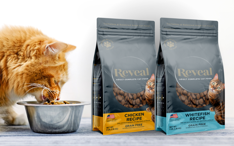
If you have a few flavours of your product or a few different types in the same range, you can illustrate these by using extra bright colours. You don’t need to stick to natural colours if you don’t want to! Each flavour could have a different colour; for example, chicken could be yellow, salmon could be pink, and beef could be red. Then, as above, label the bags with a sustainable logo or wording, and away you go!
Look at user-friendly features.
To make your packaging even more eye-catching to your end-user, add more sustainable design options to the bag, such as resealable closures. These options can appeal to your target audience because they promote less waste, which is essential in sustainability. These options also give the audience something to talk about and could give you the edge over competitors. When a specific combined with Ready2Recycle mono material PE/PE bags, Options are the winning formula for a business looking to become a B-corp or a sustainable driving force in their industry.
Sustainable packaging should be advertised as such, but it doesn’t mean brands need to mimic the colours of nature. A simple logo or wording can help get your point across, leaving you free to design the packaging you want for your brand.
If your brand is looking to invest in quality packaging and wants more information on sustainable packaging design, we will guide you through the entire print process. Providing recommendations along the way to improve efficiency, reduce costs and add untold value to the end product.
Contact us on +44 (0) 161 440 7302 or follow this link to complete our contact form.