5 Common Packaging Mistakes to Avoid. The food market is thriving with innovative ideas and fresh food concepts, whether it’s reinventing beloved comfort classics or exploring alternative protein sources. With such a diverse range of options available, how can you distinguish your product and effectively convey its value?
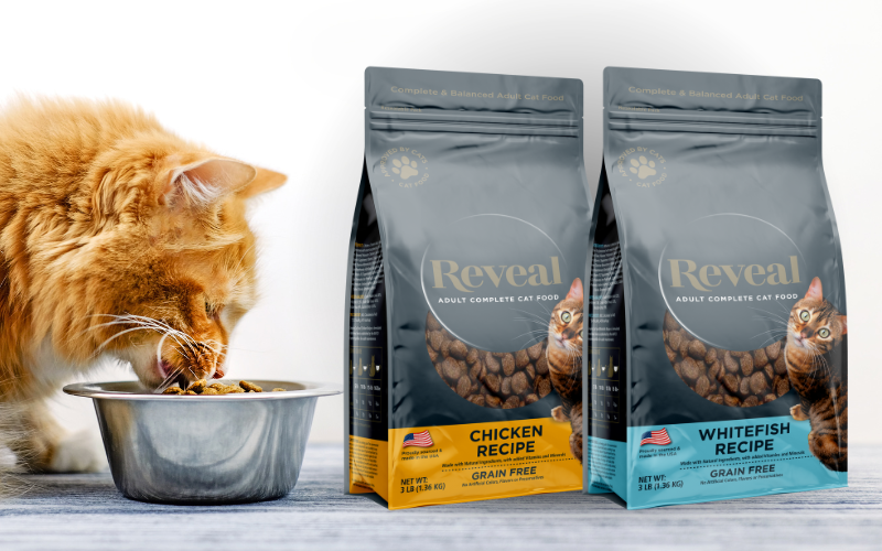
Packaging plays a crucial role in setting your product apart from the competition. Every aspect, including shape, size and colour, impacts consumer perception. Look at pet food for example, some designs are loud and bright, others are subdued yet classy, and some are playful.
Strategic packaging can significantly influence consumer purchasing decisions, but it’s important to avoid certain mistakes that can dissuade potential customers.
Let’s look at 5 potential pitfalls a business may face when a product has launched.
Choosing the right packaging format
It goes without saying that when launching a new product, choosing the right packaging format is essential. It is common practice to research the product sector and benchmark the competition but often other key aspects are overlooked or not even considered at all, such as understanding the packing process and its restrictions and checking merchandising space in the retail environment or e-Commerce requirements.
As a brand, your team needs to do their homework and talk to packaging experts like Law Print, as we can share our expertise and technical knowledge of the market to ensure that the packaging solution you have chosen is fit for purpose and the launch of your product will go smoothly.
Don’t try to overspec the packaging
With packaging, the saying “less is more” couldn’t be more true! Don’t try to overkill it with too many features or packing your product in packaging that is too big or not appealing on shelves. Today’s consumers are much more savvy than even, they know what they want – value for money, quality but also packaging that is practical and feed their increasing need for sustainability credentials.
If you don’t need to have a zipper, don’t add one! Especially if your customers are likely to open the bags with a pair of scissors and tip the food out into a container anyway. Same thing with materials, there is no need to make the bags too thick or specify high barrier films with fancy names if this doesn’t add value to your product and the way it is going to be packed and handled between the production site and the shop floor.
Saying too much might overwhelm consumers
When designing your packaging, remember that simplicity is key. Overwhelming consumers with an abundance of text on the front of your packaging is akin to trying to have a conversation in a noisy room. Everything gets drowned out. Too much information can cause consumers to disengage and fail to absorb your messaging.
Consider the front panel of your packaging as the most important part. It’s like the star of the show that makes the first impression. Instead of overwhelming consumers with too much information, choose three important things that will appeal to your target audience and meet their needs. A simple and clear front label will highlight your product’s main values.
Getting the right message across
When it comes to making a purchase, quality and taste are the ultimate deciding factors, especially when people plan to buy the same product again. No matter how healthy or checked off the boxes a product is, if it doesn’t deliver on quality or taste good, it won’t find a permanent spot in consumers’ shopping carts. Sadly, many food packaging mistakes prioritise dietary claims over taste.
Let’s consider an example: Which do you think would better communicate a product’s value? Shouting “VEGAN” on the front label or highlighting the mouthwatering, smoky barbecue flavour or the burst of sweet and tangy berries? Leaving potential customers unsure about what to expect can seriously hinder their decision-making process.
Harmonising colours with flavour profiles
Colours used in packaging influence how consumers perceive the flavour of your product. This is largely due to the associations consumers have developed over time between specific flavours and colours, influenced by marketing and experiences with natural foods.
By aligning packaging colours with the product’s flavours, you provide consumers with an easy visual guide that simplifies the decision-making process and enhances their overall product experience.
For example, in the Pet Food market, you will find that Yellow is usually for Chicken, Red for Beef, Pink for Salmon and Green for Vegan, plus more!
If your brand is looking to invest in quality packaging, we will guide you through the entire print process. Providing recommendations along the way to improve efficiency, reduce costs and add untold value to the end product.
Contact us on +44 (0) 161 440 7302 or follow this link to complete our contact form.
CASE STUDIES | CONTACT US | SOCIAL MEDIA | NEWSLETTER
Source: https://www.packagingdigest.com/packaging-design/3-packaging-mistakes-newbies-make-shouldnt
5 Common Packaging Mistakes to Avoid


