In a world that’s getting louder, brighter, and faster by the minute, Pantone’s Colour of the Year 2026 feels like a collective exhale. Meet PANTONE 11-4201 Cloud Dancer — a lofty, billowy off-white that symbolises calm, clarity, and fresh starts.
Soft yet purposeful, Cloud Dancer offers designers and brands something increasingly valuable: space to breathe.
For packaging design, this isn’t just a colour choice. It’s a mindset.
What Cloud Dancer Really Means
Cloud Dancer isn’t a stark white or a blank canvas—it’s warmer, gentler, and more human. Pantone describes it as encouraging relaxation and innovation, providing a quiet backdrop for creativity and mindful living in a noisy world.
Its message is clear:
- Calm over chaos
- Confidence without shouting
- Clarity instead of clutter
For brands, this signals a move away from visual overload and toward thoughtful, intentional design that invites trust rather than demands attention.
The Impact on Packaging Design
Packaging is often the first physical interaction a consumer has with a brand. Cloud Dancer turns that moment into something softer—and smarter.
1. Minimalism That Feels Considered, Not Empty
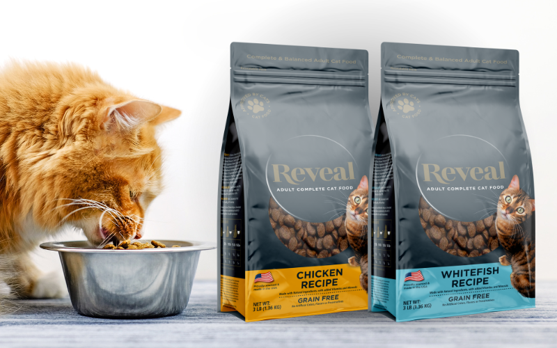
Cloud Dancer is ideal for clean layouts, refined typography, and carefully chosen details. It allows branding elements to breathe, making logos, messaging, and finishes stand out without overwhelming the eye.
2. A Perfect Partner for Premium and Sustainable Packaging
This off-white pairs beautifully with natural materials, textured boards, embossing, and subtle foils. It enhances sustainability narratives while still feeling elevated—proof that eco-conscious design can be both responsible and beautiful.
3. Letting Product and Brand Story Lead
Because Cloud Dancer doesn’t compete for attention, it creates space for storytelling. Whether it’s ingredient transparency, craftsmanship, or innovation, the packaging becomes a calm stage for the brand message to shine.
4. Shelf Impact Through Restraint
Ironically, in a sea of colour, quiet stands out. Cloud Dancer’s subtle confidence can be a powerful differentiator on crowded shelves, drawing consumers in through simplicity and sophistication.
What Cloud Dancer Says About Branding in 2026
Branding with Cloud Dancer suggests assurance, clarity, and modern elegance. It’s especially effective for brands looking to communicate:
- Trust and transparency
- Mindfulness and wellbeing
- Innovation without intimidation
- Premium quality with a human touch
This is a colour for brands that know who they are—and don’t need to shout about it.
Creating the Look: How Law Print Helps Bring It to Life
While Cloud Dancer may look effortless, executing it well in print and packaging takes experience. Off-whites are notoriously nuanced, and subtlety leaves no room for error.
That’s where Law Print’s design consultancy and pre-artwork meetings come into their own.
By collaborating early, we helps customers:
- Understand how Cloud Dancer behaves across substrates and finishes
- Balance warmth, contrast, and legibility
- Avoid designs that feel flat or unfinished
- Ensure colour consistency from concept to final production
These sessions allow brands to explore creative ideas with confidence, resolve challenges upfront, and ultimately achieve packaging that looks exactly as intended—calm, refined, and impactful.
A Quiet Colour with a Strong Message
Cloud Dancer reminds us that great design doesn’t always need to be bold to be powerful. Sometimes, the most confident statement is restraint.
As we move into 2026, this colour invites brands to slow down, simplify, and design with intention—and with the right guidance, turn subtlety into a serious competitive advantage.
If your brand is looking to invest in packaging, we will guide you through the entire print process. Providing recommendations to improve efficiency, reduce costs and add untold value to the end product.
Contact us at +44 (0) 161 440 7302 or follow this link to complete our contact form.