In our business, there is nothing more important than colour consistency.
Think about walking the paint aisles at your local home furnishing store. We all know there can be a huge difference between ‘porcelain doll’ and ‘frosted dawn’. The colours may look exactly the same but the way in which they react on the walls can depend on a number of factors. The world of print is no different. It relies on a universal language to maintain a high level of consistency across formats.
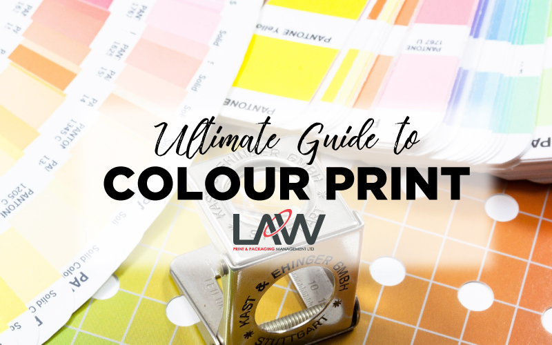
There are 2 different types of colour reference systems to help achieve global standardisation. Printing inks use either CMYK or PMS (Pantone Matching System), also known as Process Colours or Spot Colours. Both systems are designed to standardise colour across the entire print process, from initial artwork stages to mixing inks in manufacture.
To understand the difference between CMYK to Pantone, let’s get to grips with the definitions.
What is CMYK?
CMYK refers to the four inks used in the colour process, Cyan (blue) Magenta (red) Yellow and Ketone (black) abbreviated as CMYK and often referred to as ’process colours’.

CMYK refers to the four inks used in the colour process, Cyan (blue) Magenta (red) Yellow and Ketone (black) abbreviated as CMYK and often referred to as ’process colours’. Different colours are created from layering these 4 colours with varying transparencies. Mixing yellow and blue together generates greens, magenta and yellow make orange tones etc. As the colours will always be mixed together there can be some colour variations. This is why Pantone colours should be introduced to ensure colour consistency.
What is PMS (Pantone Matching System)?

Due to the sheer colour variation in CMYK, the Pantone Matching System® (PMS) was introduced to overcome inconsistencies and create a standard across the industry. Pantone or PMS colours are often referred to as ‘spot colours’. Inks are produced to a unique shade, with a specific colour formula to help reproduce accurately in print. Packaging designers and printers will refer to the Pantone series Plus Book.

They offer a great tonal range and can be used to match for example company logos, corporate ‘target colours’ or special metallic colours that cannot be achieved by mixing CMYK. The PMS helps communicate the precise colour reference between designer and printer.
Should I create artwork using CMYK or PMS Colours?
This all depends on the printing process. CMYK is mainly used for Lithography projects such as brochure printing. At Law Print we would always recommend using PMS Colour system for Flexography and Rotogravure Printing.
Here are some key things to take away:
- As CMYK print always requires the use of the 4 colours, it means that the costs will need to include 4 printing plates at least.
- Printing with spot colours is essential in Flexography and Gravure printing to obtain the best printing results and reduce colour registration issues. The use of Pantone reference is a must in colour management.
- Colour photographs will always require CMYK process colours
- Remember what you see on screen is not true to print. Colours can change from monitor to monitor, so always trust your eyes rather than the screen. Print proofs and match colours with CMYK and PMS reference guides.
- If you require exact colours to keep branding and logos consistent across formats, then using PMS colours would be the best solution to create a universal standard. (Think Coca-Cola red, Tilda blue, Asda green)
As an end to end packaging supplier, it is fascinating to see the limited understanding of spot colour vs process colours. So, if you’re going to be working with packaging it’s time to get clued up on colour space!
At Law Print we always prefer to work with brands from the early stages of the project (pre-artwork rather than repro stages) to advise on colour. This is the most efficient way to achieve the best quality and print consistency from design board to market.
Subscribe to our newsletter for all the latest packaging news and insights
