Bold and engaging packaging design is used to drive consumers to purchase. But when colours fail to pop, images are pixelated and brand colours out of sync – it can quickly affect consumer confidence in the quality of the product.
Considering a third of purchasing decisions are based on packaging and more than 70% of purchasing decisions are made in store, it is no surprise that brands look to use colour in packaging to evoke powerful emotions. In some cases, a single colour can come to encompass the entire brand, think Coca-Cola red or Starbucks green.
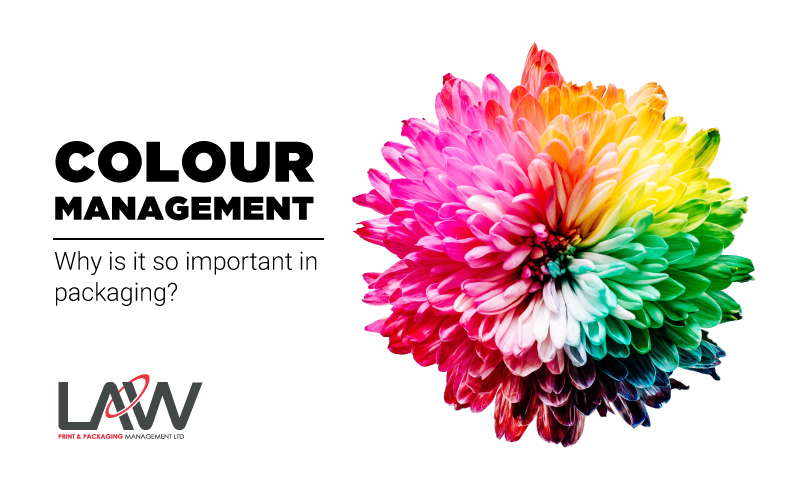
Any packaging company will tell you that colour management crucial to the success of a project. Our team explain why we manage colour meticulously throughout the entire print process.
What exactly is colour management?
Colour Management refers to the process of controlling conversion between colour represented on various devices such as computer screens, artworks, and printers.
The aim of colour management is to maintain consistency across all devices and formats. This can be from a digital photograph to a full-colour print, or in our field, a complex artwork file to a printed bag or stand up pouch.
How do you manage colour in print?
There are a number of systems used by suppliers to help with colour management. Digital systems are used in conjunction with sophisticated measuring equipment such as Spectrophotometers and Densitometers to capture and evaluate colour and ink densities.

At Law Print Pack, we use the industry leader in colour management for packaging, X-Rite. The system helps maintain accurate colour measurement throughout production ensuring we meet the exacting colour standards set by our customers.
Why is it important to manage colour in print?
The bar has been raised by brands and retailers, who continually reduced colour tolerance levels to tighten overall colour accuracy across their portfolio. But why do they feel it’s so important to ensure great colour management in print?
Over recent years it seems that colour accuracy is becoming ever more crucial. A Pantone colour institute study found that 50% of people reach past the first product if the packaging is discoloured, and two-thirds of adults said they do question the quality of a product when packaging is inconsistent with others on-shelf.
Quality
This is arguably the reason why such extensive colour management systems exist. It is well documented that consumers can look to colour consistency as a sign of quality. If your product is presented at the point of purchase with three varying shades of green, it can have an irreversible effect on your perceived quality.
Brand Consistency

As supply chain flexibility increases, businesses today look to source from a pool of global manufacturers. This will obviously create inconsistencies that will cause problems when the products are consolidated on-shelf. Keeping your brand colours on point across formats and substrates can be tricky and so colour management systems provide a great standardisation that all involved in one project can refer to.
If you need some help with colour management we’re here for you. Give us a call – even if you just have a few simple questions. We’re always happy to answer questions, after all, packaging is kind of our thing!
Subscribe to our newsletter for all the latest packaging news and insights
