There are many emerging trends and new technologies breaking into the world of consumer goods and packaging. For companies that successfully adopt and embrace them into their products, the opportunity for clear differentiation in an often crowded marketplace is huge. It’s more important now than ever before to connect and engage with your customer.
Opportunities to connect with your consumers are abundant. Especially as one of the first interactions a potential customer has with your product is through the packaging.
Heinz was an early adopter, back in 2011. Using their iconic ‘keystone’ label design as the trigger, customers could access a host of App-based recipe ideas simply by pointing their smartphone camera at a Ketchup bottle. This is connected packaging with a twist; no increase in packaging cost and no environmental impact.
So how do we create engaging packaging? Here’s your FREE 4-step checklist:
-
Consistent Design Across All Packaging
Great examples of consistent yet engaging packaging design come from Symply. They use their packaging to convey a playful nature from their brand. Their theme is echoed throughout the entire range. They use recognisable brand colours, logos, images, or other visual elements that customers associate with their brand. Thus, helping them to become instantly identifiable both online and in-store.
If your business strategy is about sustainability or natural ingredients or materials, or something else, make sure that message is translated clearly on your packaging. If your website is full of these messages, but your packaging isn’t, it will signal alarm bells to potential customers and they will second guess whether your product is the real deal as they can’t make the connection between the two.
-
Incorporate Engaging Sensory Elements
Sensory elements in packaging came part of our portfolio in 2017. The purpose is to provide another level of engagement to the customer; to also provide markers for those with disabilities.
It’s well known that consumers like to be able to touch products before purchase and for years’ brand owners have been warned of the importance of touch in consumer purchasing decisions. Although psychological research into sensory branding is in its infancy, the growth in e-commerce could make touch even more crucial for successful multi-sensory store experiences.
Read more in our article: Welcome to Multisensory Packaging
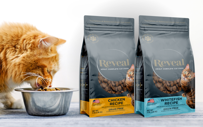
There are a number of other ways to engage your audience. Take coffee packaging for example. Adding a valve to the packaging helps the aroma of the coffee escape.
Including windows that let them see the product is another option. If there are any interactive features that the user could try, leave those exposed and let them experiment. The better your customers understand your product, the more likely it is that you’ll bust through that pesky last-minute purchasing resistance.
-
Create a Design Narrative Across Packaging Elements
Like the other aspects of your marketing, your packaging design should take shoppers on a journey. You’ll want to place your primary value propositions front and centre on the packaging face, of course, but you’ll also want to support those key selling points with additional details throughout your packaging layout.
This is exactly what Tilda did with the brand refresh of their core range of rice products. The new illustrations were based on product origins (India, Thailand, etc) and associated travelling design elements (post stamps, symbols, languages, etc), and all of these parts help to give the shopper another insight and a deeper connection to the product itself, humanising it and making it more appealing.
And here’s the thing—if customers are picking up your product and examining it, you’re halfway there. Consumers don’t examine packages and products that they have no interest in. If you’ve made it to the point where they’re holding the package, feeling the texture and reading the copy, you’re well on your way to a purchase.
-
Don’t Be Afraid to Be Different
Above all, don’t be afraid to shake things up. Go against conventional logic if you want to attract a customer’s interest. Experiment with eye-catching layouts and narratives. See what gets them talking about your product and what gets them picking it up from the shelf or clicking on your images through Google.
Your main goal should be to create the best product you can. But, after this, it’s to provide the best buying experience for your customers. Whether that is through sensory packaging, or through creating a story. You should try to stand out as much as possible, especially throughout these challenging times. Experiment with textures, features, finishes and designs.
Look at what your competitors are doing and see how you can design your product to fill the niches they aren’t addressing or look at what they’re doing and do it better.
A large proportion of consumers are now longing to know where their packaging has come from or where it will end up, which means sustainability is something that you should shout from the rooftops. Our Ready2Recycle range is exactly that – “ready to be recycled” – and most of our customers make no secret of it. Post it in bold letters on your bags or pouches, post it on your social media, post it on your website.
If you want to talk through your options, get in touch with us via phone, email or via our website.
We’re also active on social media and have a newsletter that we send out each month.


